Median Property Prices 2005-16 - PART 2!
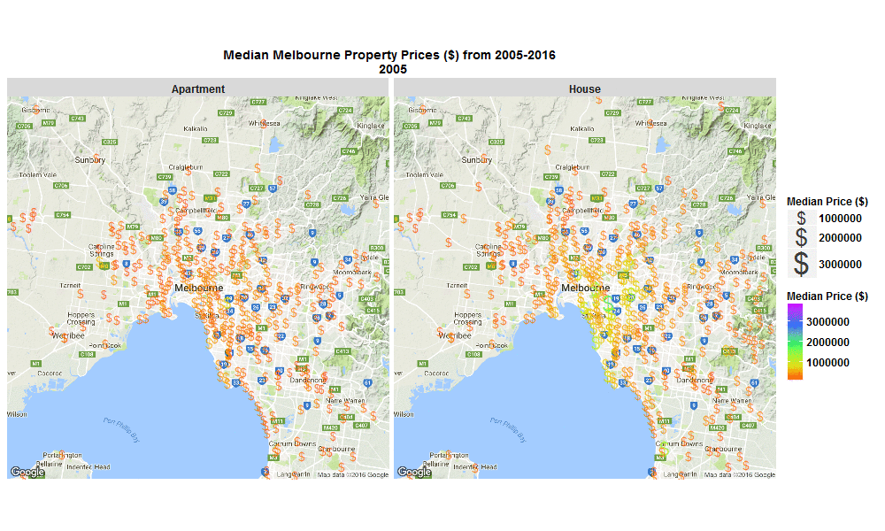
22 Oct 2016A few weeks back I made a blog post with this nice little .gif below, of change over time in Median Melbourne Property Prices ($) from 2005-2016 - see my previous blog on 29 Sep 2016 :
Well I’ve just come back to looking at that data set and this time I’ve plotted the % change per annum and overall, and also absolute $ change from 2005-2016 on some interactive plots. These plots allow you to zoom in, hover over a suburb to see more info, or click on a suburb to open a new window and explore that suburb in more detail.
The R code I used to make the plots below is here.
Explore below, it’s interesting to see that SYNDAL has the greatest per annum and overall % growth, however it’s TOORAK that has by far has the highest absolute $ growth over the same period of time.