Using the plotly package to give your ggplot2 plots simple reactivity to user input
30 Sep 2016First make up some fake revenue data for a company with a number of shops operating in each State from 2012 to 2015:
### Install/load required packages
#List of R packages required for this analysis:
required_packages <- c("ggplot2", "stringr", "plotly", "dplyr")
#Install required_packages:
new.packages <- required_packages[!(required_packages %in% installed.packages()[,"Package"])]
if(length(new.packages)) install.packages(new.packages)
#Load required_packages:
lapply(required_packages, require, character.only = TRUE)

#Set decimal points and disable scientific notation
options(digits=3, scipen=999)

#Make up some fake data
df<-data_frame(state=rep(c("New South Wales",
                 "Victoria",
                 "Queensland",
                 "Western Australia",
                 "South Australia",
                 "Tasmania"), 36)) %>%
    group_by(state) %>%
    mutate(year=c(rep(2012, 9), rep(2013,9),rep(2014, 9),rep(2015, 9))) %>%
    group_by(state, year) %>%
    mutate(`store ID` = str_c("shop_#",as.character(seq_along(state)))) %>%
    group_by(state, year, `store ID`) %>%
    mutate(`Revenue ($)` =  ifelse(state=="New South Wales", sample(x=c(1000000:9000000), 1),
                            ifelse(state=="Victoria", sample(x=c(1000000:7000000), 1),
                            ifelse(state=="Queensland", sample(x=c(1000000:5000000), 1),
                            ifelse(state=="Western Australia",sample(x=c(100000:2000000), 1),
                            ifelse(state=="South Australia",sample(x=c(100000:900000), 1),
                            ifelse(state=="Tasmania", sample(x=c(100000:2000000), 1), NA)))))))
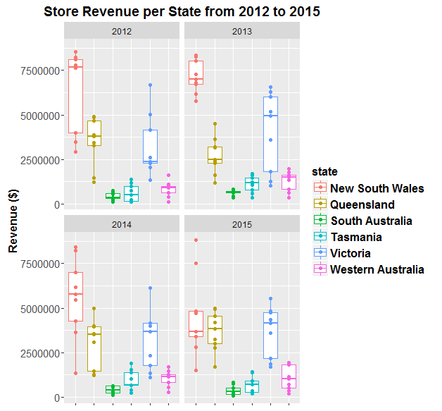
Now visualise this data using ggplot:
ggplot(df, aes(state, `Revenue ($)`, colour=state, label = `store ID`)) +
    geom_boxplot() +
    geom_point() +
    theme(axis.title.x =  element_blank(),
          axis.text.x  =  element_blank(),
          axis.title.y = element_text(face="bold", size=12),
          axis.text.y  = element_text(angle=0, vjust=0.5, size=11),
          legend.title = element_text(size=12, face="bold"),
          legend.text = element_text(size = 12, face = "bold"),
          plot.title = element_text(face="bold", size=14)) +
    ggtitle("Store Revenue per State from 2012 to 2015") +
    facet_wrap(~year)
Now make the plot reactive to the user’s mouse by wrapping plotly’s ggplotly() function around it:
p<-ggplotly(ggplot(df, aes(state, `Revenue ($)`, colour=state, label = `store ID`)) +
    geom_boxplot() +
    geom_point() +
    theme(axis.title.x =  element_blank(),
          axis.text.x  =  element_blank(),
          axis.title.y = element_text(face="bold", size=12),
          axis.text.y  = element_text(angle=0, vjust=0.5, size=10),
          legend.title = element_text(size=12, face="bold"),
          legend.text = element_text(size = 12, face = "bold"))+
    facet_wrap(~year))


##Publish to plotly
# plotly_POST(p, filename = "dans_plotly_example")