Using the plotly package to give your ggplot2 plots simple reactivity to user input
30 Sep 2016First make up some fake revenue data for a company with a number of shops operating in each State from 2012 to 2015:
### Install/load required packages
#List of R packages required for this analysis:
required_packages <- c("ggplot2", "stringr", "plotly", "dplyr")
#Install required_packages:
new.packages <- required_packages[!(required_packages %in% installed.packages()[,"Package"])]
if(length(new.packages)) install.packages(new.packages)
#Load required_packages:
lapply(required_packages, require, character.only = TRUE)

#Set decimal points and disable scientific notation
options(digits=3, scipen=999)

#Make up some fake data
df<-data_frame(state=rep(c("New South Wales",
                 "Victoria",
                 "Queensland",
                 "Western Australia",
                 "South Australia",
                 "Tasmania"), 36)) %>%
    group_by(state) %>%
    mutate(year=c(rep(2012, 9), rep(2013,9),rep(2014, 9),rep(2015, 9))) %>%
    group_by(state, year) %>%
    mutate(`store ID` = str_c("shop_#",as.character(seq_along(state)))) %>%
    group_by(state, year, `store ID`) %>%
    mutate(`Revenue ($)` =  ifelse(state=="New South Wales", sample(x=c(1000000:9000000), 1),
                            ifelse(state=="Victoria", sample(x=c(1000000:7000000), 1),
                            ifelse(state=="Queensland", sample(x=c(1000000:5000000), 1),
                            ifelse(state=="Western Australia",sample(x=c(100000:2000000), 1),
                            ifelse(state=="South Australia",sample(x=c(100000:900000), 1),
                            ifelse(state=="Tasmania", sample(x=c(100000:2000000), 1), NA)))))))
Now visualise this data using ggplot:
ggplot(df, aes(state, `Revenue ($)`, colour=state, label = `store ID`)) +
    geom_boxplot() +
    geom_point() +
    theme(axis.title.x =  element_blank(),
          axis.text.x  =  element_blank(),
          axis.title.y = element_text(face="bold", size=12),
          axis.text.y  = element_text(angle=0, vjust=0.5, size=11),
          legend.title = element_text(size=12, face="bold"),
          legend.text = element_text(size = 12, face = "bold"),
          plot.title = element_text(face="bold", size=14)) +
    ggtitle("Store Revenue per State from 2012 to 2015") +
    facet_wrap(~year)
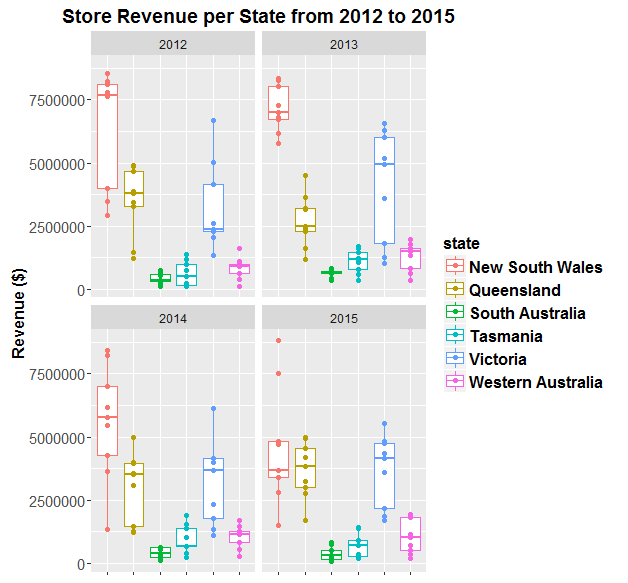
Now make the plot reactive to the user’s mouse by wrapping plotly’s ggplotly() function around it:
p<-ggplotly(ggplot(df, aes(state, `Revenue ($)`, colour=state, label = `store ID`)) +
    geom_boxplot() +
    geom_point() +
    theme(axis.title.x =  element_blank(),
          axis.text.x  =  element_blank(),
          axis.title.y = element_text(face="bold", size=12),
          axis.text.y  = element_text(angle=0, vjust=0.5, size=10),
          legend.title = element_text(size=12, face="bold"),
          legend.text = element_text(size = 12, face = "bold"))+
    facet_wrap(~year))


##Publish to plotly
# plotly_POST(p, filename = "dans_plotly_example")
This type of simple plot made using plotly and ggplot2 in R are great because they have some basic “reactivity” to user input, (e.g. hover mouse over data point and lable appears with info. about data point like “store ID”” for example), but they do not need to be hosted on a server - they are simple enough to be knitted into a stand-alone HTML document.
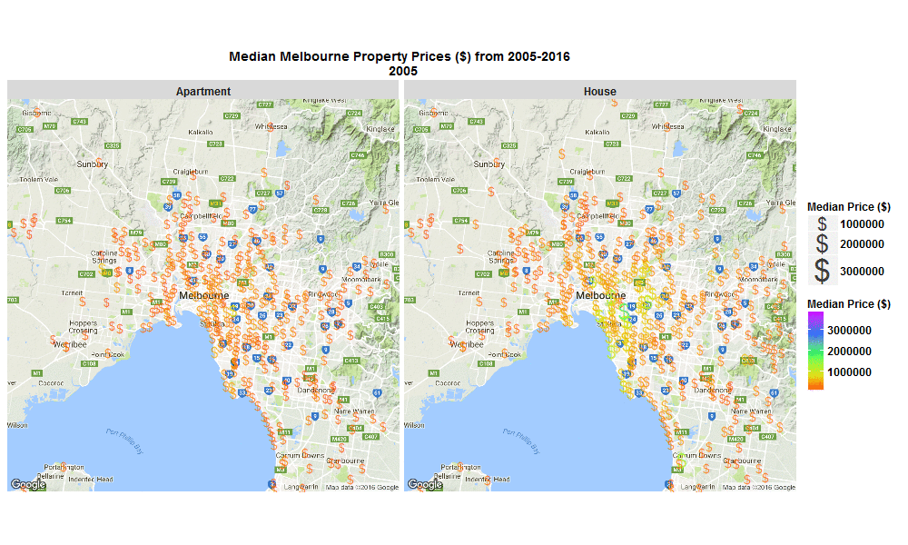
Median Melbourne Property Prices ($) from 2005-2016
29 Sep 2016I stumbled across an interesting raw dataset from Victorian Government, Australia today, It had house and apartment prices in Melbourne, Australia from 2005-March 2016 http://www.dtpli.vic.gov.au/property-and-land-titles/property-information/property-prices
Thought it worth a look…
So I wrote some R code to import the data from excel spreadsheet, tidy it, and then make this animated plot which I think is cool because you can get some insight from it in a much faster than just looking through the raw data in an excel spreadsheet. I thought it was interesting how much faster Houses are going up in value compared to Apartments. Also interesting how most of the price increases are in on the SouthEast side of Melbourne. I will drill into this dataset further when I get time, zooming in to certain suburbs, plotting vacant land over time (also included in the raw data), etc etc.
The R code I used to make the plot below is here
Click the plot to enlarge
Python for an R and matlab user
24 Sep 2016I managed to find a few spare hours this weekend so I’m trying out Python for the first time. I usually use Matlab and R for data processing, visualisation and statistics, but I wanted to give Python a try, since some of my friends at Vokke seem to really love it.
It’s early days so I haven’t actually managed to produce anything useful with Python yet, but I thought I’d start to document the steps I’m taking to learn Python for data science, from the point of view of a Matlab and R user.
-
First off, I downloaded and installed Anaconda which includes a distribution of Python, plus all the popular python packages you might need for data science.
-
Then I searched for an IDE that I like the feel of. Anaconda comes with a couple of IDE’s including one called “Spyder” which I thought seemed very good. However, I ended up deciding on using the Rodeo IDE for starters. The reason I decided on Rodeo is it is set out very similarly to the Rstudio and matlab IDEs, so I’m a little more comfortable with it to start with.
-
Third I started searching for the “python equivalents” to my favourite R packages for data science. I’m a major fan of most of Hadley Wickham’s’s R packages including ggplot2, dplyr, tidyr, lubridate, readr and readxl. So far for python I’ve found:
-
Pandas seems to be the popular package for manipulating data in python, but another package that seems closer to dplyr in R, is dplython which maintains the functional programing ideas of dplyr, including my favourite feature from magrittr and dplyr: the pipe-operator!
-
The python plotting packages seaborn, bokeh and matplotlib all seem really nice. Matplotlib in particular seems very familiar to the plotting system in matlab. But since I’ve recently become very comfortable using Hadley’s ggplot2 ‘grammar of graphics’ type plotting system, I think ggplot for python will suit me perfectly for starters!
-
…annnd that’s all I’ve got time for today, BUT I plan to keep updating this post with more info, as I come across it, that I think could be useful for somebody learning python for data science who is coming from a background of R and Matlab….so stay tuned!!
Is open science the way forward?
07 Jan 2016I’ll be finishing my PhD over the next two months, exciting times! Since I’ve got a thesis to write, I’ll try to keep this post short (or at least written in a short amount of time!). I have to give another shout out to The Peer Reviewers’ Openness Initiative (PRO) which is one of several excellent new initiatives in support of open science, and which has already received over 200 signatories. Basically, PRO outlines a mechanism whereby peer reviewers require access to data/analysis code/materials (or at least a reason from the authors why these things are not provided) before conducting a comprehensive review. This is designed to shift incentives and achieve the goal of creating the expectation of open science practices. The advantages that will come with mass uptake of open science practices, particularly in relationship to the PRO initiative, have recently been outlined in excellent blogs by researchers who are more accomplished and qualified than me (e.g. see here , here , here , here , here and here).

So this post is not about rehashing their excellent points. Rather, I wish to add another perspective to this discussion, from the viewpoint of a very early career researcher.
Since I am currently considering post-PhD career paths (e.g. post-doc positions, industry positions), initiatives like PRO are important to me, because they give me a sense of hope that over time the incentives in academic science will change to encourage open science. I’ve noticed over the last few years that the scientific publication process (at least in psychology, cognitive science, and neuroscience where I’ve been interested) is very slowly moving more in line with the ideals of open, transparent and reproducible research. I’m excited to get on board with this open science movement as much as possible early in my career - I’ve just submitted a final research paper to contribute towards my PhD, and I’ve chosen to submit it to a fully open access journal and make all of the related raw data, analysis scripts and paradigm code open source, so my results are reproducible. Hurrah!!! (I’m yet to submit a pre-registered report, but that’s next on my list of publication goals). So personally I am enthusiastic about open science. And I wonder if this attitude is shared amongst my peers?
Are early career researchers enthusiastic about open science?
I would love to see some valid data addressing this question.
Anecdotal evidence from my conversations with friends/colleagues who are at similar career stages,
suggests that many early career researchers agree that open science is the way forward.
When I’ve chatted about getting on board with the open science movement (e.g. by signing PRO , sharing data/analysis scripts, pre-registering studies etc.),
my colleagues have unanimously agreed that it is a good idea and the best way forward for science, for these reasons .
So what’s stopping early career researchers practicing open science?
There may be many perceived barriers to implementing open science practises, which are worth addressing (see links in first paragraph). But here I just wanted to comment on one of these barriers which seems to be at the forefront of early career researchers’ minds- people have pointed out to me that currently the pressures and incentives set up in academic science, particularly for early career researchers, do not always encourage or reward the extra time taken to learn and implement open science practices. One main point of concern that I’ve heard is a potential loss in the number of papers you can produce given the extra time taken to learn/implement open science practices, since criteria for awards, post-doc positions, promotions, etc. are often heavily weighted on the of number of publications, and not necessarily on how ‘open’ the science is.
Is this a valid concern? I cannot comment on changes (or lack of changes) in the weighting of open science practices as a criteria for awards, post-doc positions, promotions, etc. across research institutes. Though Felix Schonbrodt has an excellent piece about changing hiring practices towards research transparency here. I can however comment on the perceived potential loss in the number of papers you can produce given the extra time taken to learn/implement open science practices:
It definitely doesn’t take much extra time! HURRAY! It can feel like a burden at first, but there are many online tools to help with open science
(e.g. the OFS, or see this excellent post, Full Stack Science; a guide to open science infrastructure, about using GitHub, Docker Hub, FigShare,Travis CI and Zenodo), and once you get started it’s faster, easier and more enjoyable than you may imagine.
It took me 4 weeks part-time (20 hours per week, so a total of 80 hours) back at the end of 2014/start of 2015 to learn how to use
R markdown and github properly to share analysis and paradigm code. I took my time to learn it thoroughly, and this was coming from a point of complete ignorance about
R markdown and github. There are many free online options to help learn such skills, for example I learned free via these two courses The Data Scientist’s Toolbox and Reproducible Research .
And it took me about half an hour to work out that my university has an account with figshare and then to upload my 24GB of raw data, and use figshare’s neat “Generate private link” function for reviewers to access my data which can then be manually switched to public when you need it to be (i.e. once your paper is accepted for publication).
So a total of ~80 hours of my time to gain the skills to make my analysis reproducible and share raw data.
And now because I have these skills and enjoy implementing them as a usual part of my analysis pipeline,
it will take me no extra time to make my data and analysis code open in the future. In fact, this 80 hours of work actually saves me time in the long run, because of the advantages of reproducible code; it is easier to check for errors, if you comment it well you spend less time figuring out what you did later, etc. So you get back all of that 80 hours pretty quickly. In the long run, the initial time-investment pays recurring dividends.
So regarding applying for awards, post-doc positions, etc. I’m banking on the hope that the reputational gain from doing fully open science from now on, not to mention the time it saves me in the long run,
will be worth more than a small one-off expenditure of ~80 hours that it took me to learn the necessary skills.
Furthermore, if I ever need to leave academia and pursue work in industry then having programing, or at least scripting, skills for data analysis along with git/github for version control and reproducible research makes you more valuable for data science/analytics jobs in industry, than only knowing how to analyse data with the old point-and-click style methods with software like SPSS etc.
So from my viewpoint, as a very early career researcher, it definitely appears that open science is the way forward.
Open science FTW!